
Table of Contents
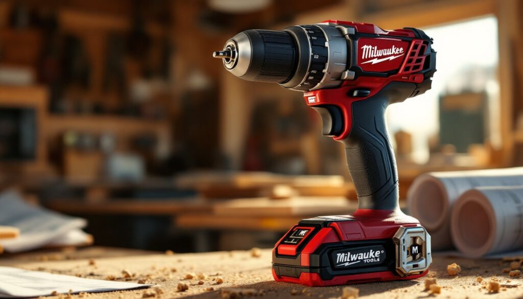
ToggleWhen you reach for a power drill on the job site, there’s a good chance you’ll spot the distinctive Milwaukee Tools logo, that bold “M” that’s become shorthand for reliability among pros and serious DIYers alike. The logo isn’t just marketing: it’s a visual promise backed by decades of engineering and real-world performance. Whether you’re tackling a deck renovation or hanging shelves, understanding what that logo represents helps you make smarter tool choices. In 2026, Milwaukee’s branding has evolved beyond the hardware store shelf to symbolize innovation, durability, and a community of builders who don’t settle for shortcuts.
Key Takeaways
- The Milwaukee Tools logo evolved from industrial roots into a globally recognized symbol of reliability, built on decades of proven product performance rather than marketing trends.
- The distinctive ‘M’ letterform, combined with Milwaukee Red and metallic accents, is engineered for legibility at any size—from tool packaging to digital platforms—creating a consistent visual system across all mediums.
- Authentic Milwaukee Tools branding protects buyers from counterfeits by featuring crisp printing, official logos, clear model numbers, and substantial packaging quality that reflects industrial standards.
- The Milwaukee Tools logo resonates with the DIY community because the brand aligns its visual identity with actual job-site use, earning organic word-of-mouth trust rather than relying on lifestyle marketing.
- Understanding the Milwaukee logo’s history and design elements helps you make smarter tool purchasing decisions and recognize the engineering rigor the brand promises to deliver.
The Evolution of the Milwaukee Tools Logo
From Local Manufacturer to Global Icon
Milwaukee Electric Tool Company started in 1924 as a small operation in Milwaukee, Wisconsin, focused on producing portable electric drills that would outlast competitors. The original branding was straightforward, simple text and foundational imagery, but as the company grew through the mid-20th century, the logo became more refined. By the 1980s and 1990s, the familiar heavy-weight “M” took shape, designed to convey strength and industrial precision.
What’s crucial to understand is that this wasn’t a rebrand born from focus groups or design trends. The logo evolved because Milwaukee’s products were dominating job sites. Contractors and tradespeople weren’t buying the branding: they were buying results. The logo simply became the visual anchor for that reputation. When TTM (formerly Techtronic Industries’ Milwaukee division) acquired the brand fully in 2005, the design remained largely intact, a signal that Milwaukee recognized the equity already baked into that “M.”
Today’s version carries DNA from those earlier iterations but feels modern without abandoning the industrial roots that earned it respect. The bold lettering, the compact form factor, and the use of deep red and metallic accents all reinforce the message: this is a tool company built for work, not weddings. That continuity matters because DIYers recognize it instantly and know it signals a certain level of engineering rigor.
Design Elements and Visual Identity
Breaking Down the Logo Components
The Milwaukee Tools logo combines several purposeful visual choices that work together to communicate the brand’s identity:
The “M” Letterform: Bold, geometric, and slightly condensed, the “M” is engineered to be legible at thumbnail size on tool packaging and across social media. This isn’t decorative, it’s practical. When you’re scanning a shelf or zooming through an online tool listing, that distinctive shape cuts through the noise. The letterform suggests stability and forward momentum simultaneously.
Color Palette: The core red (often called “Milwaukee Red”) paired with metallic accents creates contrast and visual weight. Red is high-energy and demanding of attention, which aligns with how power tools perform, direct, unambiguous, no wasted motion. The metallic elements (gold or silver, depending on the application) add a premium feel without veering into luxury. It’s the color language of industrial reliability.
Typography Integration: When the full company name appears alongside the “M,” the sans-serif typeface reinforces modernity and clarity. No serifs, no flourishes, just clean, legible communication. This approach works across packaging, truck wraps, and digital platforms, proving that a strong logo system scales across mediums without losing its punch.
These elements don’t exist in isolation. A good logo is a system, not just a graphic. Milwaukee’s identity holds up on a tool bag zipper, on a billboard, and on a 2-inch screwdriver bit. That’s not accident: it’s intentional design discipline rooted in understanding how DIYers and pros interact with brands in real-world contexts.
Why the Milwaukee Logo Resonates With DIY Communities
The Milwaukee Tools logo carries weight because the brand has earned credibility through consistent product performance, not flashy marketing campaigns. A homeowner tackling a bathroom remodel or building a fence doesn’t care about corporate storytelling, they care whether a drill will function reliably after two years of intermittent use. Milwaukee’s reputation rests on decades of tools that simply work.
Community recognition reinforces this connection. When DIYers gather on job sites, in online forums, or at tool rental centers, they see the Milwaukee logo frequently. This visibility isn’t paid for entirely through advertising: it’s organic adoption driven by word-of-mouth recommendations. That creates a feedback loop: the logo appears more often, it becomes more familiar, and familiarity builds trust. Resources like Popular Mechanics frequently recommend Milwaukee tools in hands-on reviews, which adds third-party validation to the brand promise.
The logo also signals a practical philosophy aligned with DIY values. Milwaukee doesn’t position itself as lifestyle branding, you won’t see their logo on designer gym wear or luxury home goods. It appears where work happens: on job sites, in workshop corners, in the hands of people solving real problems. That alignment between visual identity and actual use builds authentic loyalty. DIYers respect brands that don’t pretend to be something they’re not.
Recognizing Authentic Milwaukee Tools by Their Branding
If you’re purchasing Milwaukee Tools online or at a big-box retailer, knowing what legitimate branding looks like protects you from counterfeits and knockoffs. This matters because substandard tool copies don’t just underperform, they can pose safety risks.
Legitimate packaging features:
- Clean, crisp printing with no color bleeding or blurred registration
- The official logo rendered in full color (not simplified or altered)
- Product model numbers and serial numbers clearly labeled
- UPC codes that scan correctly and link to Milwaukee’s registered database
- Packaging weight and materials that feel substantial (cheap paper or flimsy boxes are red flags)
Tool-specific markers:
- The Milwaukee logo appears consistently on the tool body itself, not sticker-applied unless that’s the design standard for that model
- Metal components show appropriate finishing (no rough casting flash, which indicates poor manufacturing)
- Batteries and chargers are branded with the same visual language and serial numbers
When in doubt, buy from authorized retailers or directly from Milwaukee’s official channels. Platforms like Family Handyman review legitimate tool sources and warn against gray-market or counterfeit equipment. That extra layer of verification costs nothing and eliminates buyer’s remorse down the line.
Conclusion
The Milwaukee Tools logo represents more than a corporate identity, it’s a visual contract between the brand and the people who depend on their equipment to get work done right. Understanding that history and design reinforces smart purchasing decisions. Whether you’re setting up a home workshop or completing a single project, recognizing authentic Milwaukee branding and knowing what that logo promises helps you invest wisely in tools that’ll outlast the job and deliver when it counts.